Web Images in 2026: Why JPEG XL Came Back to Chrome, When AVIF Beats WebP, and How to Stop Shipping Megabyte Photos Nobody Asked For
- Internet Pros Team
- September 22, 2026
- Web Design
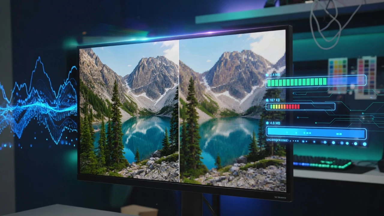
Websites have more ways than ever to make pages fast, yet on most of them the biggest single cost is the same as it was ten years ago: photographs. A hero banner exported straight from a camera, a product gallery saved at print resolution, a team photo that is four times wider than any screen that will show it. In 2026 the tools to fix this are finally all in place. Every major browser decodes AVIF, WebP is universal, and after a two-year reversal JPEG XL is on its way back into Chrome. The hard part is no longer picking a format but serving the right file to the right screen.
Why Images Still Decide How Fast a Page Feels
Scripts get the blame for slow sites, and often deserve it. But images usually account for the largest share of the bytes a page downloads, and on most pages the largest element in the first screen is an image. That element is what Google measures as Largest Contentful Paint, so a heavy hero photo is not just slow, it is slow in exactly the place search engines check.
The waste is rarely the format alone. It is a 4,000-pixel photo shown in a 600-pixel card, the same full-size file sent to a phone and a 27-inch monitor, and a hero image that waits behind a dozen lazy-loaded thumbnails. Fixing the format typically saves a third to a half of the bytes. Fixing the size can save far more.
The Four Formats Worth Knowing
| Format | Browser support in 2026 | Strength | Weakness |
|---|---|---|---|
| JPEG | Everywhere | Universal, fast to encode, every tool understands it | Largest files for the same visual quality |
| WebP | Every current browser | Roughly a quarter to a third smaller than JPEG, supports transparency and animation | 8-bit only, blurs fine texture at low quality settings |
| AVIF | Every current browser | Often around half the size of JPEG, HDR and wide colour, excellent at low bitrates | Slow to encode, can smear detail, no progressive loading |
| JPEG XL | Safari today, returning to Chromium, Firefox in progress | Lossless JPEG recompression, progressive decoding, very high quality at high resolution | Not yet safe to serve without a fallback |
PNG still has a place for screenshots and graphics that need exact pixels, and SVG remains the right answer for logos and icons, which should never be photographs in the first place.
The JPEG XL Reversal
JPEG XL was standardised in 2022 as a successor to JPEG, and Chrome removed its experimental support the following year, citing a lack of ecosystem interest. The decision was unpopular with photographers, publishers and image tooling vendors, and Apple added JPEG XL to Safari later in 2023 anyway.
In late 2025 the Chromium team changed course and said it would accept JPEG XL again, on the condition that decoding be handled by a new memory-safe decoder written in Rust rather than the original C++ library. Mozilla had set a similar condition. That detail matters: image decoders parse untrusted files from anywhere on the web and have a long history of serious security bugs, so the browsers wanted the format without the attack surface.
What makes JPEG XL interesting is not only compression. It can repackage an existing JPEG losslessly into a file around a fifth smaller and convert it back bit for bit. For a business with a decade of product photography, that is a saving that costs no quality at all.
The best image format is the one that arrives at the right size for the screen. A perfect AVIF at four times the needed width is still a slow page.
How to Serve the Right File to Every Visitor
Browsers already know how to choose, as long as the page gives them choices. Two mechanisms do almost all of the work.
The Responsive Image Toolkit
- The picture element for format. List an AVIF source, then WebP, then a JPEG fallback. Each browser takes the first one it can decode, and old browsers simply ignore what they do not understand.
- srcset and sizes for dimensions. Offer the same image at several widths and tell the browser how wide it will be displayed. A phone then downloads the 480-pixel version and a desktop the 1,600-pixel one.
- An image CDN if you would rather not build variants. Many CDNs read the browser’s Accept header and resize on the fly, returning AVIF or WebP from a single original. Make sure the response varies correctly so a cache never serves AVIF to a browser that asked for JPEG.
- Width and height on every image. They let the browser reserve space before the file arrives, which is what stops text jumping as pictures load and keeps layout shift scores clean.
Loading Order Matters as Much as File Size
Native lazy loading is one attribute and it works well for anything below the fold. It is also one of the most common self-inflicted slowdowns, because templates apply it to every image including the hero. A lazy hero waits until layout is done before it even starts downloading.
- Never lazy-load the main image in the first screen. Give it fetchpriority set to high instead, so the browser fetches it ahead of less important files.
- Lazy-load galleries, thumbnails and footers. Many visitors never scroll to them, so they should never cost anything.
- Do not hide the hero in CSS or JavaScript. A background image set in a stylesheet or injected by a slider script is discovered late. A real img tag in the HTML is found immediately.
- Keep quality settings honest. For AVIF and WebP, compare at actual display size rather than zoomed in. Most photos look identical at settings well below the defaults many export tools use.
A Practical Plan for 2026
You do not need to re-encode your whole library in one go. Work in the order the savings appear.
- Measure first. Run your five most visited pages through a performance audit and note which image is the Largest Contentful Paint element on mobile.
- Fix the oversized originals. Resize anything wider than it will ever be displayed. This is usually the single biggest win.
- Serve AVIF with WebP and JPEG fallbacks through the picture element or an image CDN.
- Correct the loading order: high priority on the hero, lazy loading on everything below the fold, dimensions on everything.
- Keep your original JPEGs. When JPEG XL support is broad enough, lossless recompression of the archive becomes a free saving, but only if the originals still exist.
What This Means for a Smaller Business
For most small business websites, images are the cheapest performance fix available. There is no framework to rewrite and no hosting move to plan. A morning spent resizing photos and adding modern formats commonly halves the weight of the pages that matter most, which shows up in faster loads on mobile data, better Core Web Vitals and fewer visitors giving up before the page appears.
The format wars are settling into something sensible: AVIF and WebP for today, JPEG XL arriving as the long-term successor to JPEG, and responsive markup to make sure every visitor gets only the pixels their screen can use.
If your site feels slow on a phone and you suspect the photos, talk to Internet Pros. We audit page weight, rebuild image pipelines and design fast websites that look sharp on every screen.